The big secret has been revealed - the new Pantone color of the year is called Very Peri! The special thing about the new trend shade with the identification number PANTONE 17-3938 is that for the first time ever, the color of the year 2022 was completely newly developed by the Pantone Color Institute.
Every year, for more than 20 years, the Pantone Color Institute of Pantone has influenced numerous industries through the traditional award "Pantone Color of the Year". The awarded colors are used in fashion, as well as in furniture and industrial design, product, packaging, and graphic design. The colors are selected by experts who observe trend analyses, materials, and technologies of various industries, as well as social developments.
Purple transformation
The fashion statement of the Pantone color "Very Peri" has already been proven by numerous runway looks of the Spring/Summer 2022 shows. As a cheerful mixture of blue, red, and violet, "Very Peri" symbolizes the global zeitgeist that is characterized by change and transformation. Purple spreads a lively, cheerful view of the world and its dynamic change, while also inspiring creativity and imagination. The warm and cheerful tone is meant to evoke a sense of confidence and carefree spirit. The pandemic-related changes, triggered by home office and digitization, are to be reflected in the newly created color tone.
How to combine "Very Peri"?
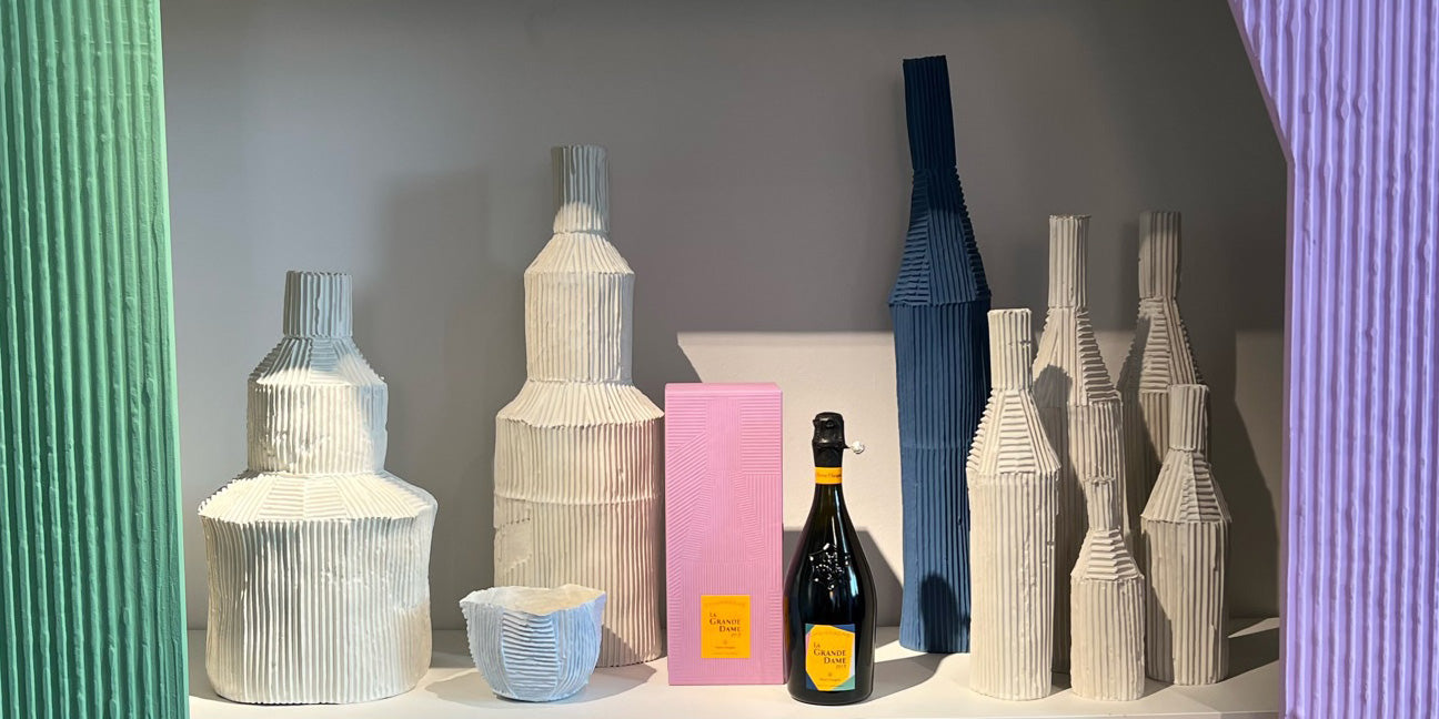
In contrast to the bright yellow "Illuminating" from the previous year, "Very Peri" can be combined in a variety of ways. Whether it's in terms of styling options or accents for your own home. For fashionable combinations, neutral shades such as beige or cream are the appropriate companions and already evoke first spring feelings. But don't worry - not everything will be purple now, but it can set new accents.
The color gradient sets the tone
According to experts, you should always take a close look at the different shades, as each shade conveys a different impression. For "Very Peri", it looks as if the color could actually become a bestseller. Because the color is between blue and purple, but more towards blue, and blue is known to be one of the most popular colors for both men and women.


